
Why Icons Matter More Than You Think

Before someone reads your copy, they've already noticed your icons.
Those tiny visual cues often decide whether they keep looking
Icons aren't there to make your packaging look trendy - they're there to help people understand your product faster.
And when your customer is juggling a dozen distractions and has about four seconds of patience left, speed matters. 😅 Every element on your packaging should help people recognise, understand and trust your product in seconds.
Here's how to communicate more in less time.
Three quick tips for your labels:
1 - Keep it functional
Use icons to highlight key features like vegan, recycled or Made in UK. Your customer shouldn't have to hunt for the important bits.
2 - Match your brand personality
A playful brand can get away with a subtle icon or even an emoji.
A premium brand? Clean, understated icons usually do the talking.


3 - Make it instantly recognisable
Use the same visual language across your packaging, website, marketing materials and product pages. Familiarity helps customers find and trust you faster.
Before & After: Less clutter. More clarity.
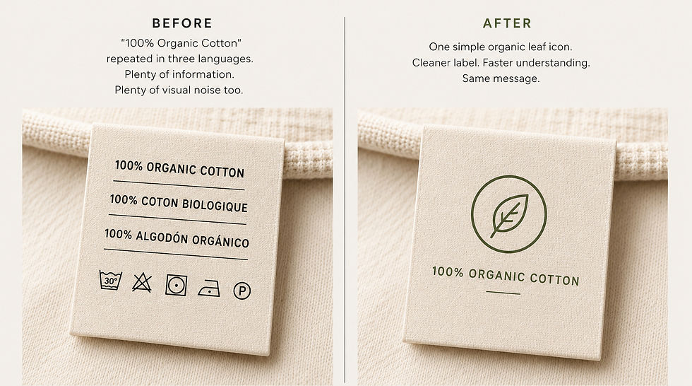
Every second counts when someone picks up your product or lands on your product page.
The right icons and visual cues help customers understand what you're offering before they've read a single sentence. They reduce hesitation, build confidence and make decisions feel easier.
Because the strongest packaging doesn't explain more.
It communicates faster.


Comments